In part 1, I talked about my Wacom tablet and ArtRage and the first drawing I created from that. It was like an overview. In this part, I’ll break down how I created the drawing. Consider this the tutorial, for those people interested in that sort of thing. It’s not an exhaustive tutorial, though, because I’m doing this from memory several weeks after completing the drawing, so I can’t say that I used this and that exact setting.
Disclaimer: I used this as a learning exercise. There are some issues with the drawing, I know, particularly in the shadows. I worked on this over a period of weeks, a little here and there, and somewhere along the line, my idea as to where the sun was must have shifted. Actually, I think as I progressed in the drawing, it got later in the day for each element. :) This is more, then, a tutorial on the tool and technique, not producing a flawless illustration. Also, I used reference images that I found online. Not thinking that I’d turn this into a post later on, I made no notes on where I got the images from. Oops. Finally, I didn’t take screenshots along the way, so to simulate the progress, I’ll be hiding layers. End of disclaimer.
Conceptually, I don’t recall exactly how I came up with this. I remember that when we used to go for walks in our old neighborhood, there was a pair of sneakers hanging over a power line we’d pass each time. I suspect that was the catalyst, and I came up with the idea of using skulls. I’m also a big fan of The Crow, especially the graphic comic, so it made sense for me to add a crow to the picture. Somewhere along the line, I decided it might be more interesting looking if I substituted a Crow-like comedy mask for one of the skulls.
I’m using Artrage 3.5.5 Studio (3.5.4 at the time). So, I started off in Artrage with a basic canvas, sized to fit the dimensions to the picture rotator at the top of my site. Except for the background (more on that later), I did the entire drawing in pencil. I primarily used the Soft Tip preset, adjusting settings as I went to get the effect/size I was after (sorry, I didn’t record which settings I used for which). I also used the Hard Shader preset for most of the shading, again adjusting the settings as I needed. For both of those, I went with a straight-up black color. I also used the Thin Precise Liner preset for some of the work around the glass.
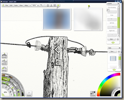
OK, so to start with, I began working on the pole. Below is a screenshot of that, minus some of the parts that I erased for higher-level layers. This was free-handed using the Soft Tip for the linings and shadow and the Hard Shader for the overall shading. Notice I made a newbie mistake, combining my drawing and shading on one layer. Much better to keep them separate until you’re sure you’re ready to combine them. Also shown are my reference images for this layer. You can see where I went back to erase for some of the later parts so that this wouldn’t be showing through.
After that, I made the bolts. I used square and circle stencils that came with ArtRage and set them to Guide Mode, then drew them with the Soft Tip pencil. To keep things looking natural, I rotated the square stencils to a random angle. Then, I hand drew the shadows and finished up the shading with, I believe, the Hard Shader.
I next did the right and left wires and attaching hardware, each on their own layers. Again, I didn’t make a separate layer for shading. Oops. I used rulers to make the wires. I cranked up the thickness of the pencil, but it still wasn’t where I wanted it to be, so I dropped the ruler slightly, and drew a second line. I liked the look with nothing between the lines and the way the pencil played against the canvas, so I left it as it was rather than filling it in. I stopped both of them before they reached the edge of the page for effect (I did the same for the bottom of the pole, if to a lesser extent).
In addition to free handing, I used some french curve stencils to help me keep the distances between my lines consistent on the curved bit of wire that connects the two sides.
The pieces jutting out from the pole took quite awhile to get them the way I wanted them. I lightened my pencil and used circular stencils to get the glass bells looking right. I used a gradient stencil for the shading and then hit parts of it with the eraser to brighten up where the light was striking it. The delicate line around the lip was, if I recall correctly, the only part where I used the Thin Precise Liner. The metal structures were drawn with the benefits of those french curve stencils and a fair amount of free handing. I’ve zoomed this in to 150% to show more detail. I found I was usually working around 200% zoomed in. At that zoom, it’s really grainy with the pencil and the canvas texture, so it helped to zoom out occasionally to see what it was looking like.
Next up, I tackled the crow. I did this one layer right, at least, starting with a pencil outline. I dropped down onto the right wire layer to erase the wire so it wouldn’t show through the foot.
But then on the next layer, I did my crow’s shading along with my comedy mask. Oy. The rest of the crow was mostly shading with the Soft Tip pencil on its own layer, darker on the shadow side to lighter on the sun side. Then, I hit the edge of it with the eraser where the light would have been striking it. With the outline on a separate layer, it made it easy.
I did the outline and shading of the mask on the same layer. Nothing terribly exciting there (except that my light source has moved again). It was all Soft Tip with varying color, thickness, and pressure.
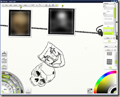
Next, I drew the skull. I drew the outline and the shadows, but not the shading, on one layer. At least, I think I kept my lighting the same between the mask and skull. I added another layer for my shading, which I think helped quite a bit with its appearance and added some needed depth (see below for the skull without shading on the left and with shading on the right).
I added the rope on its own layer. I used the same technique I did for the power lines for the straight pieces and then hand drew in the loop and knot. Originally, I just had it looping over. Then, I thought to myself that there was probably quite a weight difference between a mask and a human skull, so I changed it up so that it looped over a few times, thinking the friction and tightness might hold it in place.
Then, I did the background on its own layer. This is the only place I strayed from the pencil. I didn’t think it looked too bad as it was (see the completed drawing below minus the background layer), but I thought I could give it a little bit of a darker tone by adding in some background noise. At first, I thought I’d draw in a background by hand but quickly decided that was too much pain and time for what was only a learning exercise. So, I used a stencil called Turbulent. I don’t remember if it came with ArtRage or I found it online. I expanded it until it filled the entire canvas. Then, I made three passes with the airbrush set to black. That was way too dark, so I dropped the opacity of the layer down to 40% and pushed it to the bottom. Working on that layer, I then set to erasing that layer where it was showing through on the others. I left it so it would show through the eyes and mouth of the mask. And originally, I removed it where the pole was, but I decided it did a nice job of bringing down the brightness on that pole, so I undid the erasing. The picture on the right is the background layer after the erasing with all other layers hidden.
And that’s how I came up with this drawing, shown completed below and, at the time of this writing, in the picture rotator on the home page. I hope it was educational or entertaining or useful in some way. If you have any questions or feedback for me, please leave them in the comments or use the contact form, and I’ll do my best to answer them.


![image[12] image[12]](https://blogger.googleusercontent.com/img/b/R29vZ2xl/AVvXsEi3SViS7QI5wj_fPqM5_mdFCgJITLfrvGNjqsxKuQ8J-SpxwGifXL4OZCSEMVmPdle9nlyBsOomAOM6lSZXZkJ6Nu52_3NinLMjYJDmVAMvbmDgOqpQZO_Mstcl8g2bYrqrd35ZiD3PFL6u/?imgmax=800)
![image[11] image[11]](https://blogger.googleusercontent.com/img/b/R29vZ2xl/AVvXsEgoh-FQV4BDg3EQIhWkwGFO8Z2rAb32hNoTT5uDmeZzTMPdoxY-xjigzOFIWxK6ine9sSJySuJqiLiB6ox4eJkykXeD2GwYZ8dplh7ifcPnnrnqWrnIovO5yAfxSE-fx9H0CZbEF1m8yLPj/?imgmax=800)
![image[10] image[10]](https://blogger.googleusercontent.com/img/b/R29vZ2xl/AVvXsEgBplrJXMyq2YTsVRTWU9FaBAZyj7Cu3fZ300BE6dE76ssHAcQ845Ww6HS9mSVvsxgumOLeJAYIcYj5fL52Ss5Ce5FmTRIMa8B3ZCsWRfuhFQ_dQ9j7iP5cUETeg5fs1ER8FXura6TqcKTk/?imgmax=800)
![image[16] image[16]](https://blogger.googleusercontent.com/img/b/R29vZ2xl/AVvXsEjZ7mGKiqcwi90m9IeI-FQjVehF-h9ZrPeBT0tDPj1ect3tf3iJOaqC7ych4_RpJpOs2peAAW-6S9a5Mtx2tVMUBK7KH_Ov5CrO0s8R3Dy2RtMgWIOafn7ll-Hs5XkMl7E9SZKw8cu5RC_j/?imgmax=800)


0 Comments